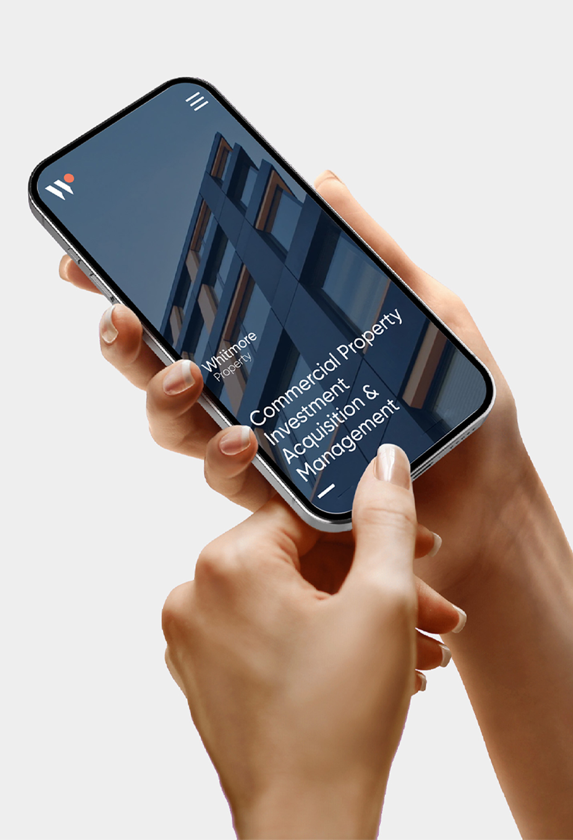

Bringing decades of expertise to life.
Challenge
With nearly 20 years of experience, and a proven track record of success, Whitmore Property required a rebrand to reflect its evolution as an organisation.
Solution
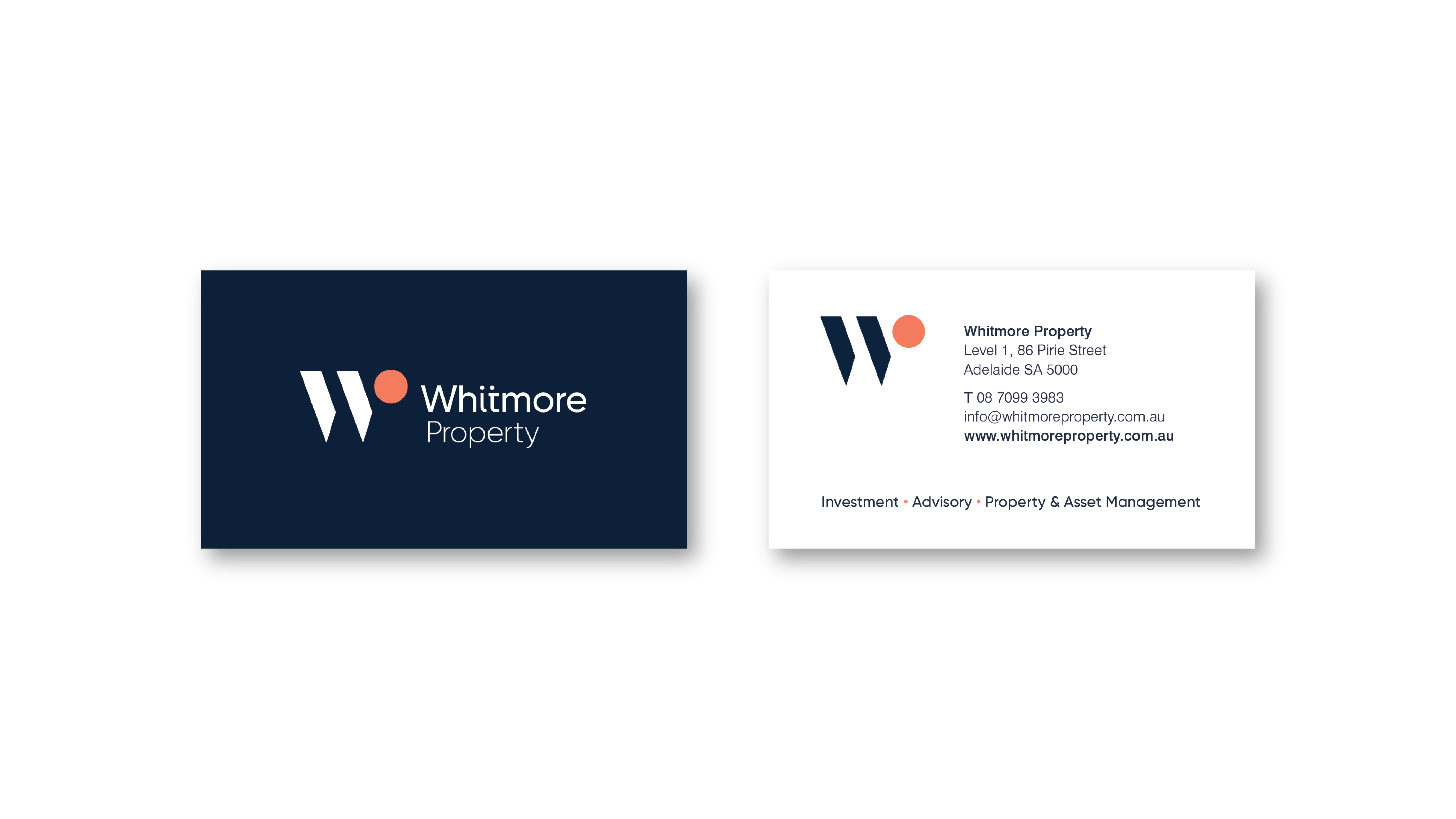
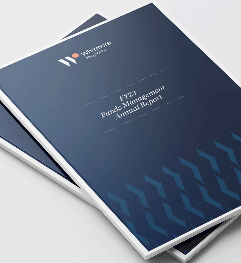
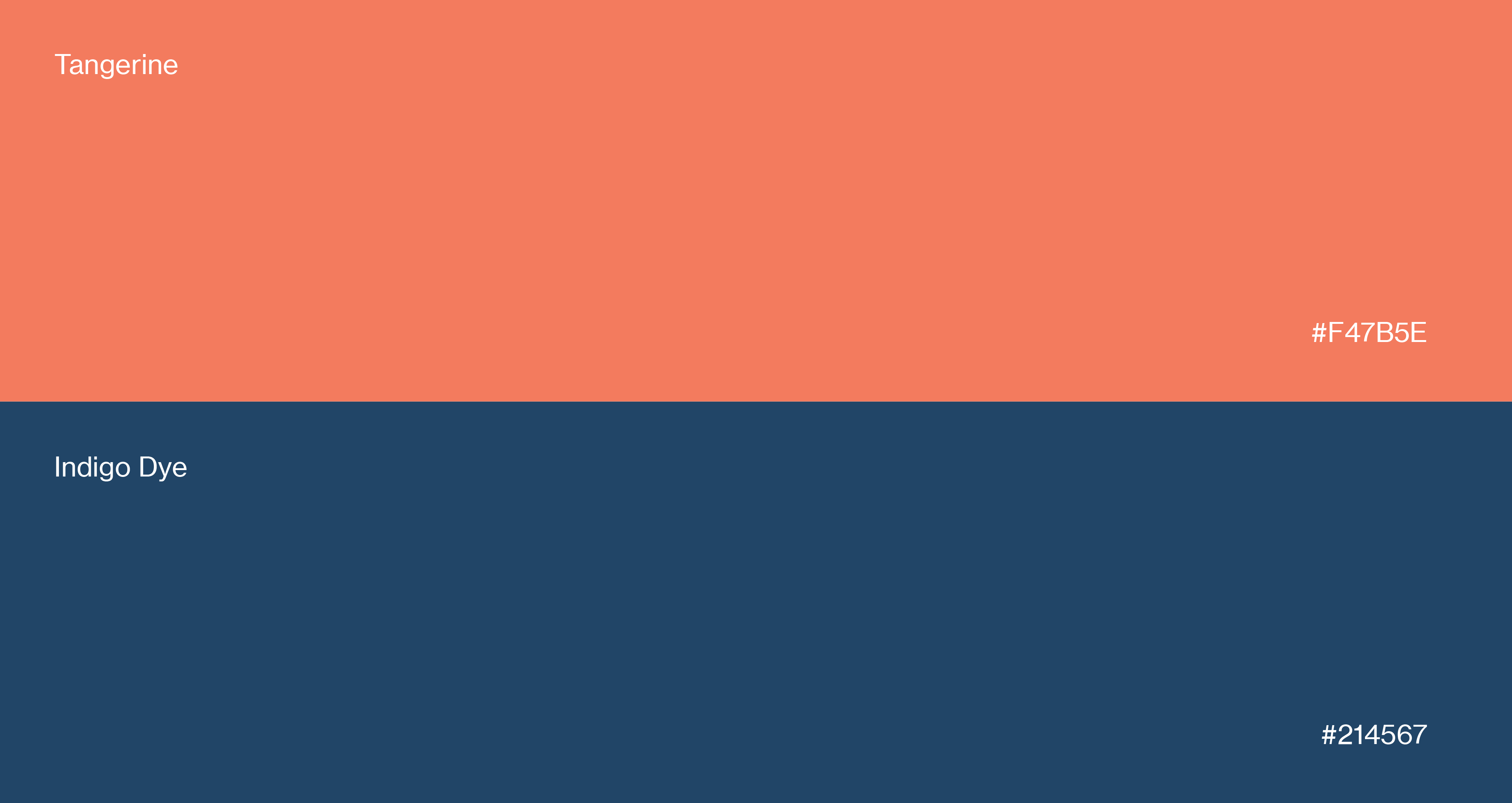
The starting point was a new logo, designed to be simple and elegant, with a focus on typography. The resulting colour palette was also updated to reflect a revised focus on service, experience and authenticity.
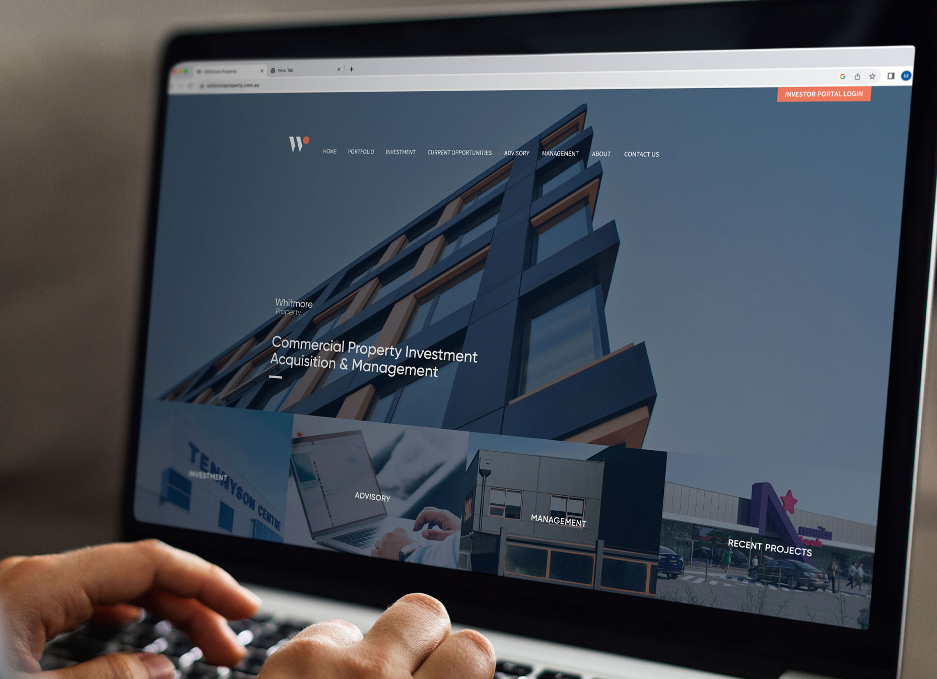
To top things off, we launched a strategically designed, responsive website to help Whitmore Property serve their clients online.